
9 minute read
You developed an app and have customers! Great job! Now they’re asking for some updates. What you do next is important…for both you and your customers.
This came up recently adding some new functionality to an application. The number of channels that users could load data from was increased, leading to a classic user experience (UX) problem for maturing products. Instead of one way to do something that’s been there from the first release, now more ways were being added for the user to make a choice, “Where do I want my data to come from?“
Why should you be concerned with this? As Product Managers, UX Designers, or others deciding how products behave, it’s important we revisit workflows when adding new features. In this example, it isn’t a big change. But, great UX is more about small, thoughtful, nuanced changes.
What’s the problem?
Since the first version, data came in from a single source. At the time, that made the most sense and was easy to quickly implement. After some growth, feedback, and (most importantly) time, it’s clear that offering a few more sources would help. Now that they are available, it’s time for an enhancement that keeps the user experience optimized.
What was once triggered automatically when a page loaded, now must require a choice from the user to pick where they want data to come from. There’s a lot of different ways to accomplish this and we’ll look at a few of them.
My thoughts on Product Management and UX
Allow me the liberty to share some of my guiding principles on Product Management and UX. I have some very strong ideas about developing solutions for users. These are items that I often passionately discuss at length with others.
- Iterative development
- Simple (for the user) is better
- Listen to your users
It’s important to leave ego out of this, to accept that things canwill change, and that there is no single, universal “right” way to do anything.
I also believe that it is better to put an imperfect solution in your customer’s hands today instead of a perfect solution in the future. Don’t take this to mean that I am advocating for releasing buggy code or code that doesn’t accomplish its purpose, because I’m not.
If you have different principles, follow those!
Going back to the drawing board
Let’s return to the new functionality. Previously, some data was loaded into a table after a page was displayed. This worked well because the user was shown what they needed without requiring anything from them and it was extremely simple.
Open page → Data is displayed
Now that there are different sources to select, something more appropriate is needed. Rather than load the data automatically, users will decide how they want the data loaded. The new approach is still simple, but with more steps.
Open page → Select channel for data → Load data → Data is displayed
This workflow can be optimized and some tips will be shared later.
Buttons (1 click)
This is the simplest approach and might be the first one that you consider. Basically, every way to load will be available by clicking a button.
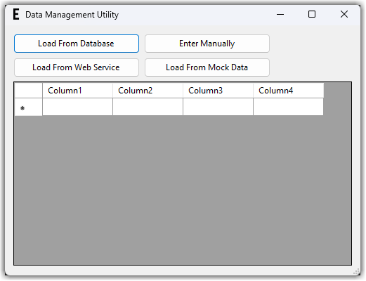
This makes it easy for the user to select their source. It only requires a single click, so the friction to the user is kept low and the options are clearly separated, which should prevent clicking the wrong button. By creatively labeling your buttons, you can allow users to “click” them with an Alt+key combination. This helps users that don’t like to take their hands off of the keyboard. Further, it’s easy to enable or disable buttons based on any conditional logic. For example, if users must provide a username or password to load data one way then you can keep that button disabled until it’s properly set up (or -better yet- use that to trigger a prompt for the user to enter that data).
One disadvantage to this, as you can see above, is that it can clutter the screen and overwhelm your users. It also may not be the best use of your screen when developing an app for a phone.
Radio Buttons (2 clicks**)
This is similar to using buttons but offers some differences to how users make their choice. Radio Buttons offer a way to select a single item, or how data is loaded in this example, ensuring that the user understands only one choice can be selected. These choices can be grouped together in a more concise and easy-to-read section.
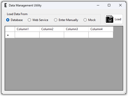
Like buttons, labels can leverage an Alt-key combination and enabling or disabling options remains easy to use. Typically, a separate button triggers the choice selected by the user. This does add a second click and increases the friction a little. It’s possible to leverage the OnChecked event for the radio button to trigger the choice and skip this step. This depends a lot on your users and how confused they might be without a button.
This approach may not be the most proper in every scenario. Radio Buttons are not used often compared with other UI approaches. As a result, they may not be the most intuitive for your users.
DropDown Buttons (2 clicks**)
Recommending this approach is cheating a little. DropDown Buttons are not part of standard toolkits, but they are a great way to extend the functionality for a regular button by overriding the default layout and behavior through subclassing.
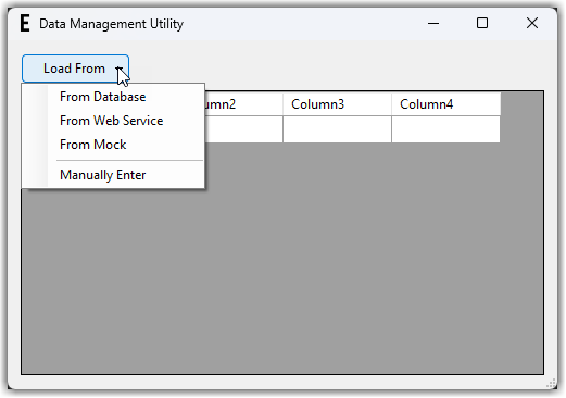
This is a great way to add a little something extra to a button that’s still intuitive for users to work with. With some extra development you can keep an Alt-key combination, although it is less intuitive because users cannot see all the different options without first clicking on the arrow to show them. This approach also introduces a second click to the user and increases the friction. If the choice does not change often, you can negate this by setting the button to a default value triggered by the OnClick event of the main button, when the user doesn’t click on the arrow.
There are some disadvantages here also. If users aren’t familiar with this then they may not realize that they need to click on the button’s arrow to see what options are available. As a developer, if you are not familiar with subclassing controls then it’s a more complicated approach and, perhaps, impossible if your development platform does not support it. It’s more difficult to make the button “keyboard-friendly” for those users that don’t like to switch back-and-forth between their mouse and keyboard. There are also some challenges when using this on a device with performance or memory limitations. On these devices the “clicks” may not register correctly and the button may respond in unexpected ways, frustrating your users.
Menus (2+ clicks)
Menus work well for visually organizing functionality together and menus have been used in programs for decades. This is helpful because it makes the UI easier to work with since most people are familiar with menus. Depending on how you set the menus up, finding the functionality may or may not be intuitive. Two different options highlight this point below.
In the first example, we are using a specific option on the top-level menu.
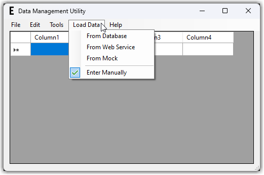
Here is a different example when you can’t fit another item on the top-level menu.
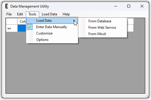
Like the previous approaches, menus can leverage Alt-key combinations and enabling or disabling options remains relatively easy to implement. Items on a menu can also include a checkmark to visually indicate the choice that the user made last. However, this approach introduces more clicks and increases friction. It’s also important to understand that menus may not be an option for you if you are creating a web page or a mobile app. While it is technically possible to add them in these cases, it could be confusing which might frustrate your users.
And the winner is…
Radio Buttons!
After speaking with the users and thinking through the workflows, this was selected for the first approach to solve the problem. The users’ needs were placed as the highest priority driving this decision.
As with any feature, once this solution is delivered it will be monitored to see how users actually interact with the application and any necessary adjustments based on their usage will be made.
Remember, your focus should be on solving the problems facing your users and you should seek their input when introducing or updating features.
**Some thoughts on efficiency
Here are some additional notes to demonstrate how these approaches can be tailored to your users, resulting in the best possible experience. These might even help you decide which approach to choose.
Do your users make different choices often? If multiple options are important to cover a wider group of your users, but the choice doesn’t change much, this lowers the cost of adding extra clicks. That means you can default the choice to whatever was used last and automatically load the data for your users so that there are no extra clicks added (and no friction).
Following this approach, you can move the choice to either a different area on the screen, a settings dialog box, or trigger a prompt when the user first uses the functionality if no choice has been made yet.
In summary
For a relatively simple enhancement to an existing product, you can see that there are a lot of approaches to implement it and several different considerations for each one. It is important to be intentional in your decisions, but also to remain open-minded and flexible when more information is learned.
Your users will appreciate your attention to detail.
To wrap this up, remember the following tips:
- Explore different options
- Talk to your users
- Don’t be afraid to change your approach and iterate
Let me know if you have other approaches that solve this problem.